Brodak-Portfolio
| home page | visualizing debt | critique by design | final project I | final project II | final project III |
Jonathan Brodak’s Data Visualization Portfolio
- Web page URL: https://brodak01.github.io/Brodak-Portfolio/
- This repository: https://github.com/brodak01/Brodak-Portfolio
Online Portfolio
This is my public portfolio of data visualizations I created! I created these visualizations while I was enrolled in the course “Telling Stories with Data” at Carnegie Mellon University. I hope you enjoy my work!
About me
My name is Jonathan Brodak, and I use he/him pronouns. I am a native of Southwestern Pennsylvania, being born in the small town of Carmichaels and growing up in Washington, PA, which is a suburb of Pittsburgh. I graduated from Allegheny College with my Bachelor’s in History with a minor in Biology, and I am currently a Master’s student at Carnegie Mellon University studying Public Policy and Management.
I live in the city of Pittsburgh and have recently adopted two kittens: Poppy and Haku! I’ve never cared for cats before, so it has been a new and exciting experience for me. Feel free to ask me for pictures of them!
I have multiple hobbies that I try my best to balance. I enjoy jogging and hiking for exercise. You can often find me jogging through Schenley Park in the morning! I love baking bread, my favorite is the French Boule. I’ve been learning how to cultivate and bake Sourdough, but my first two attempts haven’t been successful just yet! I love exploring new countries! So far, I’ve visited 14 countries in the world, my most recent being Japan in August 2024!
What I hope to learn
- I would like to learn what makes an effective chart. I tend to add details and fill in any white space I can find, which could lead to inferior charts. Knowing what is best practice would be great!
- I hope to learn which programs on the computer create the best graphics that I can work with. I know there are many visualization software out there, but I would like to find one that I am confident in and one where I am proud of the work I can produce.
- I would like my skills to be pertinent to this course and throughout the rest of my future career paths. I hope to work in economic development once I graduate from Heinz. I understand how important data is in our modern world, so I must feel confident in producing effective graphs to better position myself within this workforce.
Portfolio Examples:
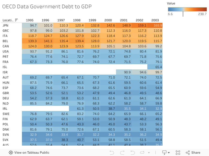
Assignment: Visualizing Government Debt
For this assignment, I found a visualization of government debt, broken down by country, from the OECD’s Data Website. We can see that the data is organized from the lowest percentage of debt to GDP ratio on the left (Estonia, 25.52% of GDP) and rising to the highest percentage of debt to GDP ratio on the right (Japan, 242.89% of GDP).
In Tableau, I created a Heat Map of all of the Data:
I also edited this dataset to create this Treemap of the data from 2018:

The first visualization is a standard bar graph, which works well, but the data could be represented to tell a better story. The second visualization, the heatmap, shows all of the OECD’s data from 2007 to 2019. This data gives the whole picture and, with the color gradient, allows us to easily see trends in the data. I chose this Treemap from the 2018 data. I wanted to highlight specifically one year of data so that we could see how the debt-to-GDP percentages compare to one another. The reds highlight a higher debt to GDP, while the blues highlight a lower debt to GDP. I also edited the nation Aliases so that someone who does not know the OECD country codes could still read the graphic.
Assignment 3 & 4: Critique by Design
This assignment is listed under the “Critique by Design” link due to the length of the article. Click on the link above to view!
Final project
For my Final Project, I decided to look into which zoos you should support to support animal conservation efforts. Below are three links that layout my process with my final project. Part 1 is the basic outlines and concept with some very basic concept charts. Part 2 outlines working with the data, creating visualizations in Tableau, and getting user feedback to improve their design. Finally, Part 3 is about implementing these changes are creating a final presentation using Shorthand. I hope you enjoy reading my process!